Welcome back. If HTML is the skeleton of your webpage, then CSS is the wardrobe, the haircut, the paint on the walls, and the lighting all at once. CSS stands for Cascading Style Sheets, and its job is to make your pages look good.
Without CSS, every webpage would look like a Word document from 1996 — black text on a white background, blue underlined links, no spacing, no colour. Boring, and impossible to read on a phone. CSS fixes all of that, and it does it in a beautifully simple way: you write rules, and the browser follows them.
The word cascading in CSS is important. It means that when several rules apply to the same element, the browser does not panic — it has a calm, predictable system for figuring out which rule wins. We will talk about that a bit later, and I promise it is less scary than it sounds.
What does CSS actually do
CSS is a separate language from HTML, but they work hand-in-hand. You write your HTML with structure and meaning, then you write CSS that says what each part should look like. The browser reads both files and combines them into the colourful, well-spaced, on-brand page your visitors actually see.
Anatomy of a CSS rule
Every CSS rule has three parts: a selector, a property, and a value. That is the whole grammar. Once you understand those three, you can read any stylesheet in the world, no matter how big.
The selector says which element to style. The property says what to change about it. The value says how. Here is a picture to make it concrete:
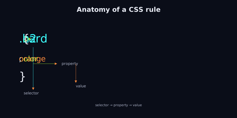
Look at the picture. On the left, h1 is the selector — it picks every <h1> on the page. Inside the curly braces, we have two declarations. Each one is a property (like color) followed by a colon and a value (like tomato). Easy.
One thing that trips people up at first: the colon between property and value, and the semicolon at the end of each declaration. Forget the semicolon and the next declaration is treated as part of the value. Forget the colon and the browser quietly ignores the whole line. The semicolon on the very last declaration is technically optional, but I always include it — it is one less thing to worry about when you add a new line later.
Selectors you will actually use
Selectors are how you tell CSS which elements to target. Here are the ones you will use ninety percent of the time.
h1— every<h1>on the page..card— every element withclass="card"on it. The dot means "by class."#hero— the one element withid="hero". The hash means "by id."a:hover— a link while the mouse is hovering over it..card > h2— an<h2>that is a direct child of an element with classcard.h1, h2, h3— every heading. The comma means "and also."
Get comfortable with element, class, and id selectors and you can style almost anything. The rest you can look up when you need them. The MDN selectors reference has the full taxonomy when you need it.
The box model
Here is the single most important idea in CSS, and the one most beginners struggle with at first. The box model is the mental model that explains how every element takes up space on the page.
Every single thing you see on a webpage is a rectangular box. Text, pictures, buttons, links — all boxes. Every box has four layers, from the inside out:
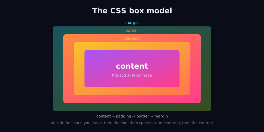
- Content — the actual text or image inside the element.
- Padding — the space between the content and the border. Like the foam inside a picture frame.
- Border — the line around the padding. Could be invisible, could be a thick red line, anything.
- Margin — the space outside the border, pushing other elements away. Like personal space at a party.
Here is the part that confuses everyone the first time. By default, when you set a width, the browser adds the padding and the border on top of it. So a box with width: 200px and padding: 20px takes up 240 pixels of horizontal space, not 200. That catches beginners off guard all the time.
The fix is a single line of CSS that you will write in every project you ever do:
* {
  box-sizing: border-box;
}
That little rule tells the browser: "when I say width: 200px, I mean the whole box — content plus padding plus border — should be 200 pixels." Once you put that at the top of your stylesheet, the box model starts to feel sensible again. It is one of those tiny habits that pays off for the rest of your career. You can read more about it in the MDN box model reference.
Your first stylesheet
Time to actually write some CSS. Create a file called style.css next to the index.html you made in the HTML lesson. Put this inside it:
body {
  font-family: system-ui, sans-serif;
  background: #0a0d18;
  color: #e9ecf5;
  max-width: 720px;
  margin: 0 auto;
  padding: 2rem;
  line-height: 1.6;
}

h1 {
  font-size: 3rem;
  background: linear-gradient(135deg, #ff8a3d, #ff3d8a, #3dffff);
  -webkit-background-clip: text;
  background-clip: text;
  color: transparent;
  margin-bottom: 1rem;
}

a {
  color: #ff8a3d;
  text-decoration: none;
}

a:hover {
  text-decoration: underline;
}
That is a small but real stylesheet. The body rule sets the default font, the dark background, and centres the content on the page. The h1 rule makes your heading glow with a gradient (the trick is to set the background and then clip it to the text). The a rule styles links, and a:hover underlines them on hover.
Notice how max-width: 720px combined with margin: 0 auto centres the content. That little pattern is everywhere — it is how you make a page readable on a giant monitor without lines of text stretching all the way across, which is genuinely hard on the eyes.
Linking the stylesheet to your HTML
A CSS file sitting on your hard drive does nothing on its own. You have to tell your HTML to load it. Add this single line inside the <head> of your HTML file:
<link rel="stylesheet" href="style.css">
The rel="stylesheet" part tells the browser what kind of file this is. The href is just the path to the file, same as the src on an image tag. Reload your page in the browser. The text should be dark, the heading should glow, and the links should be a warm orange.
If nothing changed, you probably have the file in the wrong folder. The path in href is relative to the HTML file. If your index.html and style.css are in the same folder, just style.css works. Otherwise, write the relative path like css/style.css or ../style.css. The browser's dev tools can tell you exactly what file it tried to load and why it failed.
Units: px, rem, em, %, and friends
Whenever you write a size in CSS, you have to say what unit it is in. The most common units you will meet are px, rem, em, and %. They behave quite differently, and choosing the right one makes your page work well across phones, tablets, and giant monitors.
- px — pixels. A fixed number of screen dots. Easy to reason about, but does not scale for users who need bigger text.
- rem — multiples of the root font size. If the root is 16px, then
1remis 16px. Great for typography because it respects user preferences. - em — multiples of the parent element's font size. Useful for nested scaling, but trickier because it compounds.
- % — a percentage of the parent's size. Common for widths and heights when you want things to scale with their container.
- vw / vh — viewport width and viewport height.
100vwis the full width of the browser window. Useful for full-screen sections.
Here is a rule of thumb that will serve you well: use rem for typography, % or fr for layout widths, and px only for tiny visual details like borders and shadows. You will rarely need anything else.
The cascade: when rules collide
Here is where the cascading in CSS earns its name. Two rules often try to style the same element. Which one wins? The browser uses a simple priority order, from most specific to least specific:
- Inline styles —
style="color: red"written directly on the element. Avoid these. - ID selectors —
#hero. - Class selectors —
.card, attribute selectors, and pseudo-classes like:hover. - Element selectors —
h1,p,a.
If two rules have the same specificity, the one that comes later in the stylesheet wins. So you can always override a rule by writing a more specific one further down. There is also !important, which beats everything — but please do not use it. It makes your CSS a nightmare to debug six months later.
Here is a quick way to read specificity if you ever need to debug. Count the number of IDs in your selector (each one is worth 100 points), the number of classes (worth 10 each), and the number of element names (worth 1 each). Add them up. The selector with the higher number wins. The numbers are just a handy mnemonic — under the hood the browser does proper binary comparison.
Common beginner mistakes
These are the things that bite every beginner. Save yourself the frustration by knowing them up front.
- Forgetting the unit.
margin: 10does nothing. You needmargin: 10pxormargin: 1rem. The only exception is zero:margin: 0is fine. - Using
!importantto fix things. Do not. The real fix is almost always a more specific selector. - Hardcoding pixel sizes everywhere. Use
remor percentages so things scale nicely on different screens. - Putting styles inline on every element. Keep them in a stylesheet. That is the whole point of CSS.
- Not understanding the box model. Re-read the section above until it clicks. Everything in layout depends on it.
- Selector typos.
.cardd(two d's) will not match anything. Open the browser's dev tools and inspect the element to see what classes are actually applied.
If you have already made some of these mistakes, that is normal. We have all been there. The trick is to make each mistake once, learn from it, and move on.
Going one step further: pseudo-classes and pseudo-elements
Now for something a little cooler that you do not have to know right away, but will become useful within a week. CSS has things called pseudo-classes and pseudo-elements — selectors that match elements based on state, or that target a specific part of an element.
You have already seen :hover, which is a pseudo-class: it matches an element only while the mouse is over it. There are many others:
:focus— an input that currently has the keyboard cursor in it.:first-child— the first element inside its parent.:nth-child(2n)— every second element. Great for zebra-striped tables.:disabled— a form control that has been disabled.
And there are pseudo-elements too, which target specific parts of an element rather than the element itself:
::before— inserts content before the element's content.Further reading
CSS is a moving target, so we trust only the docs that the platform vendors themselves maintain. MDN is where we send every beginner; the W3C specifications are where we go when we need to settle an argument about exact behaviour.
- MDN CSS reference — the exhaustive reference for every CSS property, selector, and at-rule, with browser-compatibility data baked in.
- W3C CSS specifications — the full set of CSS specifications from the W3C CSS Working Group, including drafts and recommendations.
- MDN Learn CSS — MDN’s guided learning track from the box model through to modern layout, animations, and responsive design.
::after— inserts content after the element's content.::placeholder— the placeholder text inside an input.::selection— the text the user has highlighted with their mouse.
Notice pseudo-elements use two colons (like ::before) and pseudo-classes use one (like :hover). The distinction is mostly historical — older browsers only supported the single-colon syntax for everything, and modern CSS keeps both for compatibility.
A classic use of ::before is adding a decorative icon next to a heading without adding extra HTML. For example:
h2::before {
  content: "→ ";
  color: #ff8a3d;
}
That makes every <h2> start with an orange arrow, with zero changes to your HTML. Pseudo-elements are a tidy way to add visual flourishes without bloating your markup.
FAQ
Quick answers to the questions that come up most when teaching CSS for the first time.
Should I learn CSS Grid or Flexbox first?
Learn Flexbox first — it is simpler and covers most everyday layout needs. Then learn Grid. Both are essential, but Flexbox has a shallower learning curve for the typical one-dimensional layout (a row of items, a centred box). For deeper coverage, see our CSS Grid for Beginners article.
Why does my CSS sometimes not apply?
The three most common reasons, in order: a typo in your selector, a missing link tag in your HTML head, or the cascade being overridden by a more specific rule. Open the browser's dev tools, inspect the element, and look at the "Computed" tab — it shows you exactly which rules the browser is using.
What is the difference between id and class?
An id is for one unique element on a page (use it for the page header, the main navigation, the footer). A class is for groups of elements (cards in a grid, list items in a menu). In CSS, ids are more specific than classes, so over-using them makes your styles harder to override.
Should I use a CSS framework like Tailwind or Bootstrap?
Once you understand vanilla CSS, frameworks can save you a lot of typing. But start with plain CSS first. You will never regret understanding the basics.
How do I make a layout that works on phones and desktops?
Use % or rem for widths instead of px, set a sensible max-width on the body, and add media queries to change the layout at different screen sizes. We have a full article on this: Responsive Web Design in 2026.
Homework
Take the favourite.html file you built in the last lesson. We are going to make it look good.
Create a file called style.css in the same folder, then link it from your HTML. Inside style.css, write rules that:
- Give the page a dark background and a light text colour.
- Make the
<h1>large and use a gradient colour for the text (copy the gradient trick from earlier in the article). - Give the bulleted list a slightly different background colour and some padding so it stands out.
- Style the link so it is a bright colour, and make it underline only when you hover over it.
- Add
box-sizing: border-boxat the top of the file. - Centre the whole content using
max-widthandmargin: 0 auto. - Use
remfor all the font sizes — nopxfor type. - Add a
::beforepseudo-element on the heading for fun.
Reload your page and admire your work. Once this looks good, you are ready for the next article, where we make the page actually do things with JavaScript. Back to HTML if you need to brush up on something, or hop straight into JavaScript for Beginners.